
Color has always been one of architecture’s most powerful tools—not just for visual delight, but for emotional and psychological impact. Whether vibrant and energetic or subtle and grounding, color shapes how we experience buildings long before we ever step inside. At Optima®, color isn’t just applied—it’s embedded into the DNA of each structure. Through thoughtful exterior palettes, we tell visual stories that connect people to place, shape perception, and elevate everyday experience.
The Psychology of Color in the Built Environment
Color has a profound influence on mood and cognition. Cool hues like blues and greens often evoke calm, balance, and introspection, while warmer tones like reds and oranges suggest energy, passion, and warmth. Neutral tones can communicate elegance, clarity, and modernism. Architects and designers have long drawn on color theory to create desired emotional effects—and these insights are more than intuitive.

The Munsell Color System, developed by artist and educator Albert Munsell in the early 20th century, organizes color based on three perceptual dimensions: hue (the type of color), value (lightness or darkness), and chroma (color intensity). This structured approach allows designers to select colors with precision and purpose—balancing brightness, saturation, and contrast to shape spatial experience.
At Optima®, these principles are woven into every exterior design. Our use of color is never arbitrary—it’s a calibrated response to location, light, material, and mood.
The Use of Color at Optima®
Across our communities, exterior palettes are carefully composed to create harmony between architecture and environment. In Scottsdale, Optima Kierland Apartments® and Optima Sonoran Village® use desert-inspired tones—ochres, sage greens, deep terracottas—that align with the surrounding Sonoran landscape. These palettes are designed with low chroma and medium value, creating an earthy richness that’s both calming and rooted in place.
In Chicago, Optima Signature® and Optima Lakeview® explore a different end of the spectrum. Here, we draw on higher-value, lower-chroma hues like charcoal gray, soft black, and glass blue to reflect the urban context and seasonal light shifts. The result is a sophisticated tonal balance that feels clean and contemporary but never sterile. Wood accents and textured materials in projects like Optima Lakeview® add warmth and tactile variation, offering contrast without overpowering the overall composition.
Creating Continuity Through Color
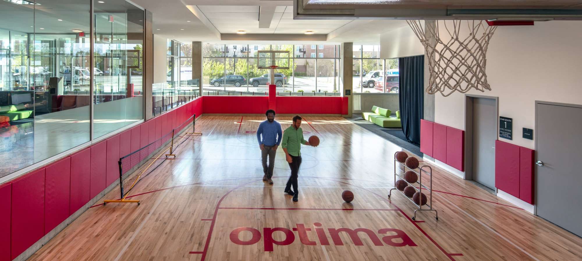
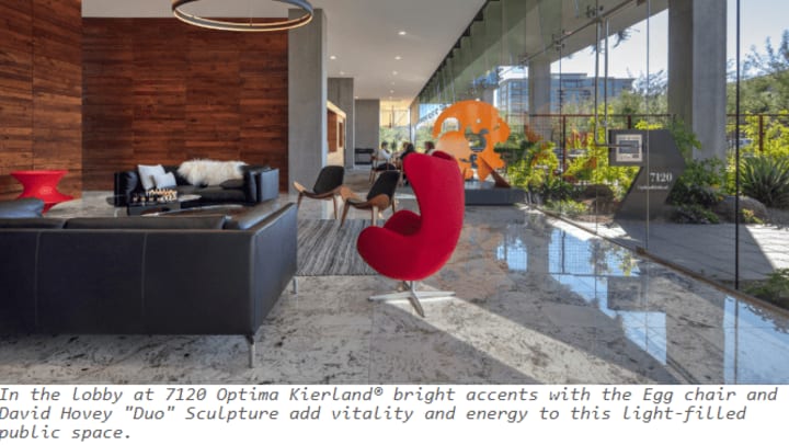
Color at Optima® is not confined to facades. Our vertical landscaping, interior finishes, and communal spaces often echo the building’s exterior palette, creating a holistic sensory experience. This reflects another principle from color theory: simultaneous contrast—how colors influence one another when placed side by side. By repeating tones across surfaces, we create visual continuity and emotional cohesion.
Our color choices also support our commitment to wellness and biophilic design. Natural hues—drawn from plants, minerals, and the changing sky—foster a subconscious connection to the outdoors, which has been shown to reduce stress and improve wellbeing.
A Palette That Evolves With Time
Just as natural light animates a building, it also transforms its color. That’s why we select palettes that shift gracefully throughout the day and year. A muted green might appear silver at sunrise and forest-rich by dusk. This responsiveness is essential to Optima’s approach. As the Munsell Color System reminds us, color is not fixed—it’s dynamic, relative, and deeply perceptual.
In every Optima® development, color is more than a surface treatment. It’s an architectural element, a mood-setter, and a storytelling device. It shapes how a building feels, how it fits into its context, and how residents connect to it over time.
Because in the end, color isn’t just what we see—it’s how we feel in a space. And at Optima®, we design for both.